01 / A welcome
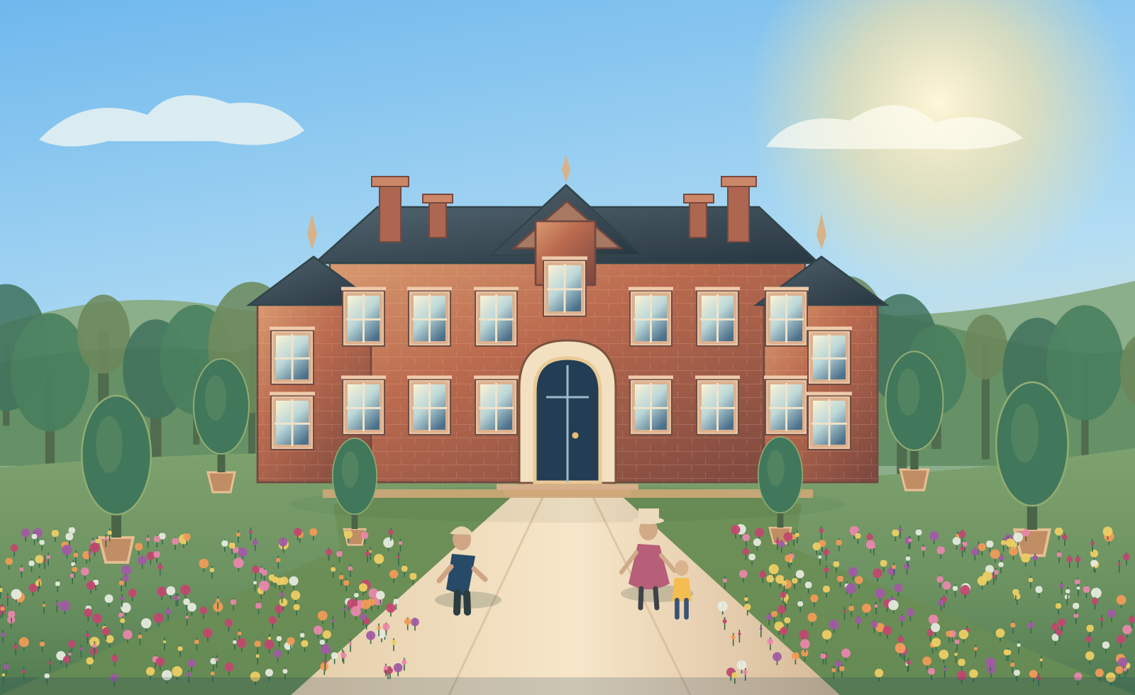
Arrive somewhere extraordinary
Rich blue, gold detailing and confident typography create a sense of occasion without losing warmth.
50 Years of Visitor Memories · 1977–2027
A celebration of the place, the people and the moments that stay with us — expressed through an original anniversary identity.
Explore the creative visionRoyal blue brings distinction. Gold marks the occasion. The gardens bring warmth and seasonal colour. At the centre is a simple idea: for generations, a visit to Sandringham has become part of people's stories.
Rich blue, gold detailing and confident typography create a sense of occasion without losing warmth.
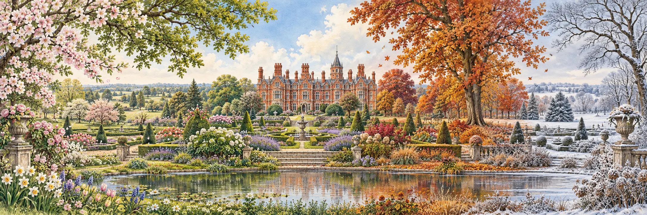
The changing seasons supply a living palette of flowers, foliage and beautifully illustrated places.
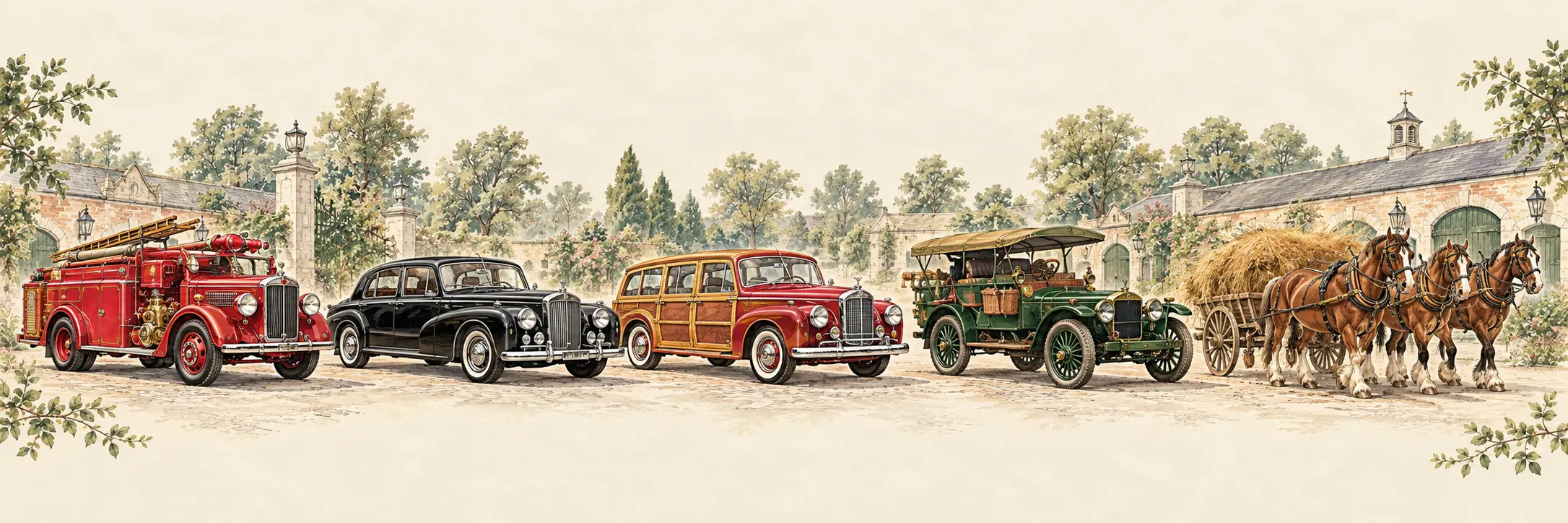
The Stables collection brings discovery, craftsmanship and human stories into the anniversary experience.
Eight coordinated tones for digital, print, illustration and visitor wayfinding.
#123D7A#0B284C#D2AF69#FCF7ED#315746#A04460#BD704D#849B67House & Gardens
The Stables
Parkland
A place for every generation.
Discover places, plan a visit and enjoy the stories behind the landscape.
Explore visitor experienceThese applications are visual proposals, not actual Estate signage, tickets or published visitor information.
Confident, timeless and welcoming.
Seasons, wildlife and flowers bring the place to life.
The Estate remains the experience, not the interface.
Every detail should be worthy of the story it tells.